The problem:
It's difficult for users to attend equipment training in person.
Additionally, the information is difficult to retain.
The solution:
A training application to teach students how to use Texas State's Make-It-Lab, known as The MiL.
My Role:
User Research, Wireframing, Prototyping, Usability Testing
Tools:
Adobe CC, Figma, Design Thinking methodologies
Style Guide
The MiL
The MiL is equipped with 3D printers, die cutters, laser cutter, and CNC machine.
Information Architecture
Research Process:
Defining the Scope
The MiL is a new lab that has only been opened a couple semesters. In-person training is offered Fridays at 1 p.m., which can be difficult for students to attend. Additionally, in-person training is often completed months before students use the equipment which leads to a memory retention problem. The MiL training app allows users to receive training at their convenience and the ability to to access prior training for a quick refresh.
Ask the Experts
Stakeholder interviews consistent of undergraduate and graduate students and professors.
Personas
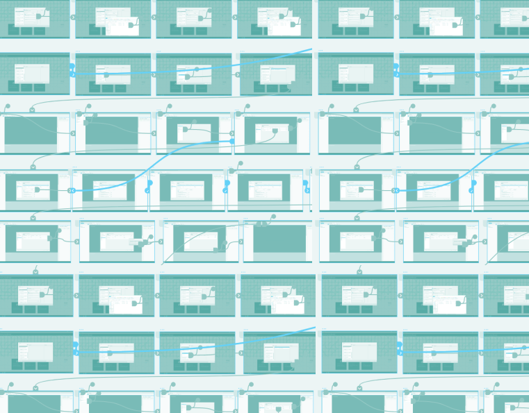
User Workflow
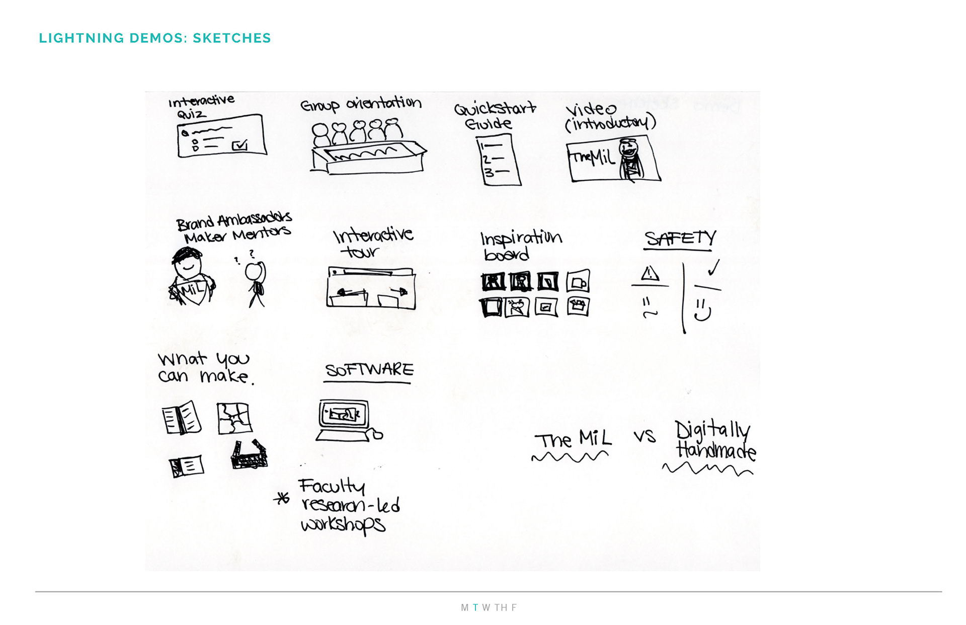
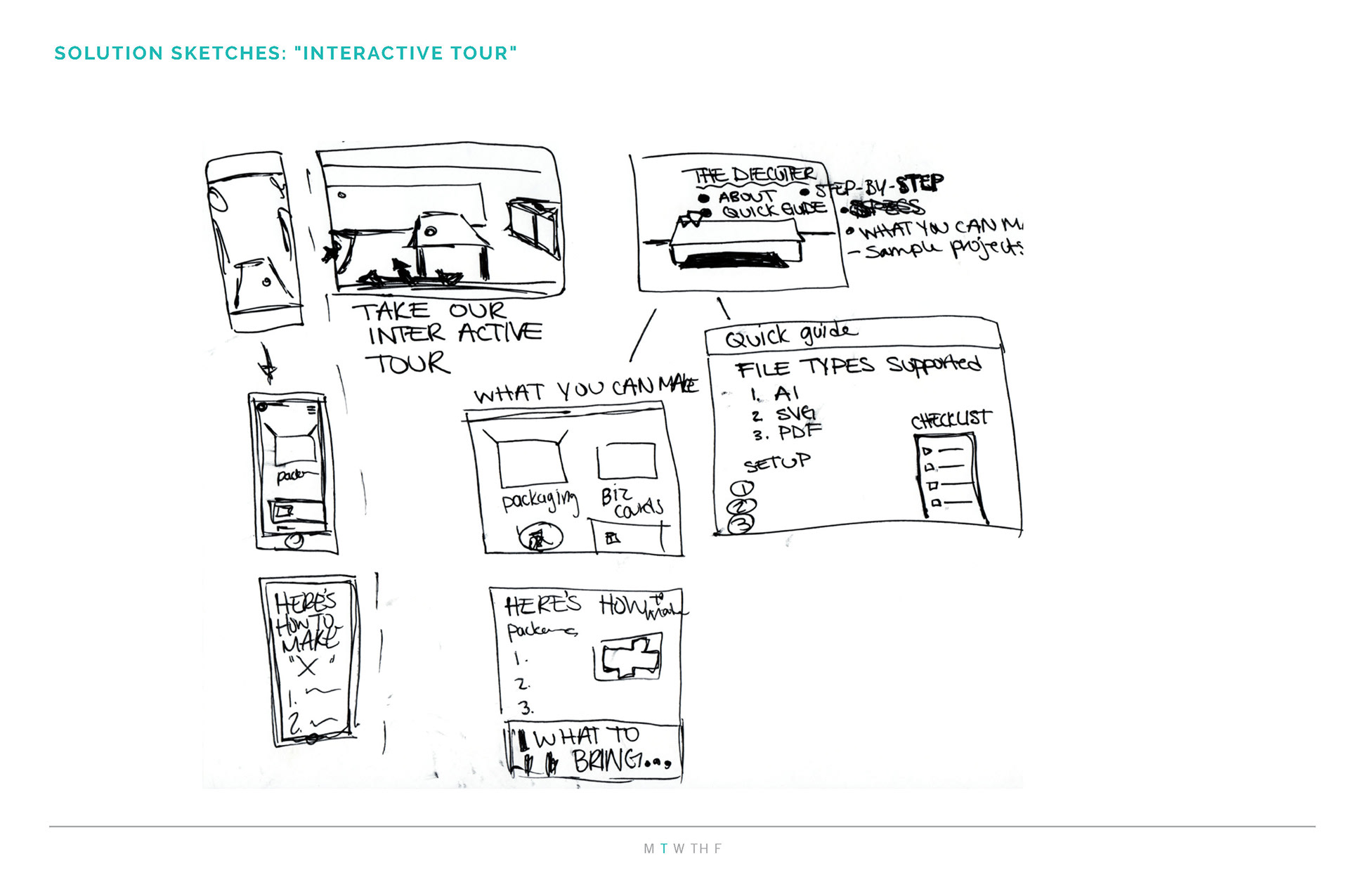
Design Sprint
Steps included lightning demos, sketching, crazy 8's, and solution sketches.
Key Findings
– Other maker labs offer a mixture of video and written training methods.
– The training portion needs a visual representation: either a human spokesperson or a mascot.
– Users need to be able to see their progress.
– Users need to know how long the training will take in advance.




Low-Fidelity Prototypes
Wireframes

